


Getting business card layout and dimensions right isn’t as simple as you might think. Whether you’re designing your first batch or updating your existing cards, understanding the standard measurements and layout rules makes a big difference.
You know what’s interesting? Each region has its own specific standards, and getting these details right can really set you apart in business settings.
Highlights
- Standard business card dimensions vary by region – North American cards are 3.5″ × 2″, while European cards measure 85mm × 55mm. Always check local standards before printing.
- Include safety margins of 0.125″ from card edges to protect important content from trimming. This simple step prevents text and logos from being cut off.
- Paper thickness impacts card durability and feel. Standard 14-16pt works for most businesses, while 18-32pt offers a premium experience in hand.
- Design with a clear hierarchy – name and logo first, followed by contact details. Keep fonts readable (minimum 8pt) and leave enough white space.
Why Standard Business Card Dimensions Matter
Look, there’s actually a good reason why business cards come in standard sizes. Think about it – when was the last time you tried putting an oddly-sized card in your wallet? Here’s what makes standard dimensions so important:
Print Production Benefits
Here’s something practical: standard sizes are usually cheaper to print. Why? Because printers have their machines set up for these dimensions, and they can run multiple cards on a single sheet. Plus, you’ll get more consistent results every time you order new cards.
Professional Presentation
Standard dimensions help your cards look right at home next to others. It might seem like a small detail, but it shows you understand and respect business conventions. It’s kind of like wearing the right outfit to a meeting – it just fits the situation.
Standard Business Card Measurements
Let’s break down the exact measurements you need to know. Each region has its own standards, and getting these right makes a real difference.
North American Standards
If you’re in the US or Canada, here’s what you need to know about business card sizes:
- Basic dimensions: 3.5″ × 2″ (88.9mm × 50.8mm) – this is your finished card size
- Bleed area: 3.75″ × 2.25″ – give yourself this extra space for background elements
- Safe zone: 3.25″ × 1.75″ – keep important stuff like text within these margins
For paper thickness, you’ve got options:
- Standard cards: 14pt to 16pt – good for most business uses
- Premium cards: 18pt to 32pt – these feel more substantial in hand
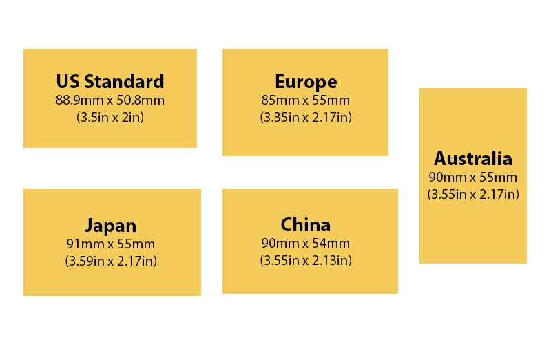
International Dimensions
Business cards vary a bit around the world. Here’s a quick look at standard sizes:
Europe: 85mm × 55mm
- Popular in EU countries
- Slightly shorter than US cards
- Matches credit card size
Japan: 91mm × 55mm
- Called “meishi”
- Bit longer than European cards
- Designed for dual-language info
China: 90mm × 54mm
- Similar to European size
- Common in mainland China
- Works well with Chinese characters
Australia: 90mm × 55mm
- Mix of European and Asian standards
- Common throughout Oceania
Here’s a handy comparison table:
| Region | Width | Height | Notes |
|---|---|---|---|
| North America | 3.5″ (88.9mm) | 2″ (50.8mm) | Most common in US/Canada |
| Europe | 85mm | 55mm | Credit card size |
| Japan | 91mm | 55mm | Longer format |
| China | 90mm | 54mm | Slightly smaller |
| Australia | 90mm | 55mm | European influence |
Essential Layout Guidelines
Let’s talk about how to organize your card’s content so it looks professional and gets your message across.
Basic Layout Structure
Grid System Setup:
- Start with a basic 3×3 grid
- Helps align elements consistently
- Creates natural focal points
Margin Requirements:
- Keep at least 0.125″ from edges
- Text needs more breathing room
- Icons can go closer to margins
Information Hierarchy:
- Name/logo gets prime position
- Contact info follows
- Extra details come last
White Space Distribution:
- Don’t pack the card too tight
- Leave some empty areas
- Makes important info stand out
Typography Spacing:
- Use consistent line spacing
- Group related information
- Keep font sizes readable
Content Placement
Logo Positioning:
- Usually top left or centered
- Size proportional to card
- Clear space around it
Contact Information:
- Group phone/email together
- Social media below main info
- Address on separate lines
Text Alignment:
- Left align for readability
- Center align for formal look
- Stay consistent throughout
Visual Elements:
- Keep graphics simple
- Use icons sparingly
- Match your brand style
QR Code Tips:
- Place in bottom corner
- Make it big enough to scan
- Test before printing
Business Card Format Options
Traditional Orientations
Let’s look at your main options for card orientation – each has its own strengths.
Horizontal (Landscape) Layout:
- The classic choice, using the full 3.5″ width
- Natural reading flow left to right
- Works great for most industries
- Plenty of room for logos and text
Vertical (Portrait) Layout:
- Uses the 2″ width as your base
- Fresh take on traditional design
- Perfect for photos or tall logos
- Good for minimal information
Alternative Card Formats
Square Cards (2.5″ × 2.5″):
- Stand out from standard sizes
- Work well with centered designs
- Great for artists and creatives
- Usually cost a bit more to print
Mini Cards (3.5″ × 1.5″):
- Half the height of standard cards
- Work as tags or small promos
- Best for minimal information
- Easy to slip into small spaces
Folded Cards (3.5″ × 4″):
- Double the space when opened
- Good for menus or price lists
- Can include detailed services
- More expensive to produce
Special Shapes:
- Rounded corners: Softer look, less wear
- Circular: Eye-catching but tricky to store
- Oval: Unique without being impractical
- Die-cut: Custom shapes that match your brand
Technical Specifications
File Setup Requirements
Resolution:
- 300 DPI minimum for sharp printing
- Scale artwork at 100%
- Check image quality at actual size
Color Mode:
- Use CMYK for printing
- Convert RGB images
- Watch out for color shifts
Bleed Area:
- Add 0.125″ on all sides
- Extend background elements
- Keep important stuff away
Safe Zone:
- Stay 0.125″ from trim
- All text inside this area
- Prevents cutting mistakes
File Formats:
- PDF: Best for printing
- AI/PSD: Keep for editing
- Export with marks included
Print Production Guidelines
Paper Stock Selection:
- Standard: 14-16pt card stock
- Premium: 18-32pt thickness
- Coated or uncoated finish
Coating Options:
- Matte: Professional look
- Gloss: Makes colors pop
- Soft-touch: Premium feel
Print Method Compatibility:
- Digital: Good for small runs
- Offset: Best for large orders
- Consider special finishes
Color Calibration:
- Use Pantone colors when needed
- Check printer proofs
- Account for paper color
Quality Control:
- Review physical proofs
- Check all text carefully
- Test special finishes
Digital Adaptation
Digital Business Card Considerations
Screen Display:
- Design for different screens
- Keep text readable
- Use web-safe colors
File Optimization:
- Small file sizes
- Quick loading times
- High-quality images
Device Compatibility:
- Works on all phones
- Easy to share
- Quick to update
QR Code Integration
Setup Requirements:
- Minimum 1″ square size
- High contrast colors
- Clear scanning area
Implementation:
- Link to digital profile
- Update content easily
- Track scanning stats
Layout Best Practices
Essential Elements
- Company name and logo
- Your name and title
- Contact information
- Website or social media
- Clean, readable design
Industry-Specific Tips
Corporate/Finance:
- Conservative layouts
- Traditional typography
- Quality paper stock
Creative/Design:
- Bold visual elements
- Unique formats
- Special finishes
Healthcare:
- Clear information
- Professional appearance
- Easy-to-read text
Bottom Line
Let’s wrap this up with the stuff that really matters for your business cards.
Think about this: your business card often stays with people longer than your first conversation. So getting the size and layout right isn’t just about following rules – it’s about making sure your card does its job properly.
Here’s what you should take away:
Size and Format
- Standard sizes (like 3.5″ × 2″) are popular for good reasons – they just work
- Match your region’s common dimensions to look professional locally
- Only go custom if it clearly helps your business goals
Design Choices
- Keep text big enough to read (at least 8pt font)
- Leave empty space – don’t try to cram everything in
- Put important info where it’s easy to spot
Practical Tips
- Get physical samples before big print runs
- Check how your card looks in different lighting
- Make sure it fits standard card holders
Quality Matters
- Good paper feels better and lasts longer
- Clean printing shows attention to detail
- Sharp, clear text makes a difference
Remember: your business card is like a tiny billboard for your business. Simple, clear, and well-made usually wins over flashy and complicated.


